How To Use Contrast In Interior Design Without Making Rooms Feel Chaotic
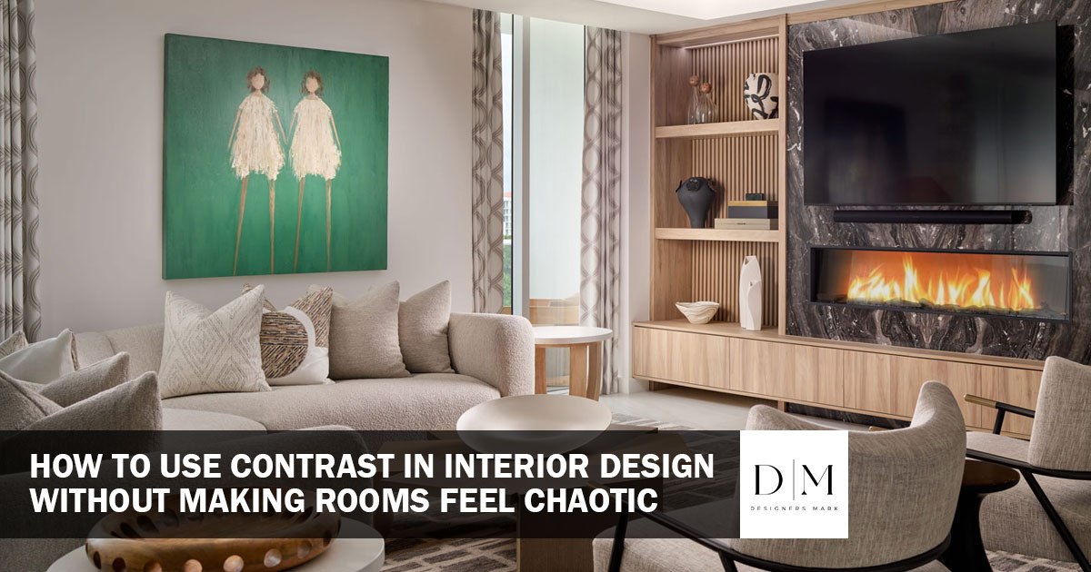
Contrast in interior design toes a fine line between chaotic and harmonious. You want your space to feel thought out, with an interior style that benefits from pops of color and texture, but if you overdo it, your home ends up feeling cluttered, busy, and created without a design-oriented eye. Let’s take a deep dive into interior design principles to find out what separates chaotic versus balanced contrast.
Finding Your Baseline For Contrast In Interior Design
Contrast occurs when we place at least two different materials, colors, textures, or styles in proximity to each other. For contrast to occur, we need to choose a foundational tone or color palette that we use as our baseline tone for our home. While two bright tones against each other are classed as contrasting, they may create an overwhelming feeling that doesn’t evoke balance. We recommend choosing a neutral base palette to use in the majority of designed spaces.
Neutrals don’t have to be beige or white. Warm tones like terracottas bring a natural, summer-inspired feeling into your home, while soft greys and creams can evoke a more modern, seaside feel. Most importantly, these tones shouldn’t be too overwhelming, as they’ll be used in roughly 80% of your designed spaces. With your neutral set chosen as a baseline, you can start exploring how to add contrast.
Adding Contrast Through Form In Interior Design
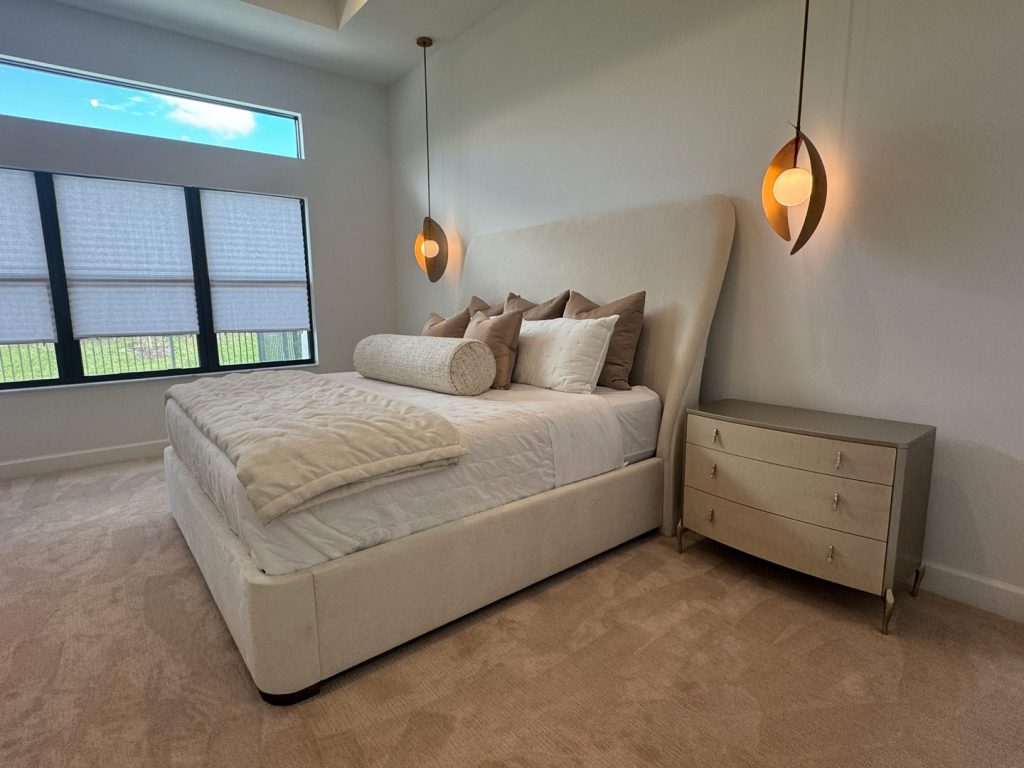
Contrast doesn’t just mean color. There are plenty of ways you can add contrast to your home’s interior design, including through texture, scale, pattern, and levels. Using contrast artfully involves matching some elements of design while opposing others. Use the same material in a different tone, or perhaps use differently sized identical elements to disrupt the monotony of unchanging repetition.
Interior designers use an 80/20 balance to keep contrasted elements in check. Around 80% of a space should use your base neutrals or textures, and 20% of your space can provide contrast through accents and focal points. The larger the accent piece, the less you need to accessorize with your contrast element in the rest of your space.
Color
Using color in your interior design is one of the easiest ways to add contrast to your space. But what separates cohesive color from cluttered color in interior design? If we use our 80% rule for neutrals, use the remaining 20% for colored accents. However, remember that color may come into your space in several ways. Placing strong hits of color in a space definitely draws the eye, but make sure to sandwich these items with neutrals in their periphery.
A jewel-toned sofa, for example, adds intrigue through color in a neutral-toned room. However, if you place it on an equally jewel-toned rug, the contrast effect begins to feel overwhelming. The pieces immediately surrounding your accented furniture should give your contrast space to breathe.
Texture
Texture is a subtle, visually intriguing way to add contrast into a space. To avoid cluttered contrast, limit your space to two or three varying textures only for larger furnishings. Take a look at the natural materials of your space. If you have wooden cabinets and a wooden dining table, add texture by swapping out your drawer pulls for custom metallic hardware. Jute rugs can be visually balanced by soft linen curtains. Look at the core elements of your design and find matches in the same color palette but that explore different textures.
Scale
Scale is essential in creating cohesive contrast in interior design. Too many items that are the same size make our eyes fatigued and detract from each item’s individual design style and strengths. Mix and match small and large elements to create a balanced level of contrast. This is especially important when curating home accessories.
By nature, many home accessories are sized for shelves or table tops. However, only filling your home with pieces of this size will give your space an unfinished, cluttered appearance. Explore home accessories, wall art, sculptures, and larger furnishings like tables and chairs that vary in size and scale.
Levels
Much like scale, how you arrange your furniture in levels impacts the effectiveness of your contrast pieces. Start by breaking down your space into low, medium, and high levels. Low items could include coffee tables, rugs, and ottomans. Mid-level furniture includes seating, consoles and beds. High-level furniture primarily includes wall art and ceiling lighting fixtures. We need to create a balance of these levels in every space in our home in order to create visual contrast.
A room that leans too heavily towards a single area can feel unbalanced. Additionally, we should avoid placing too many similar level items close together without contrast. Taking a standard living room set up as an example, picture how low-level elements like rugs, bracket sofas, and armchairs, which are in turn framed by statement lighting or wall decor.
Curating Spaces By Sight Lines
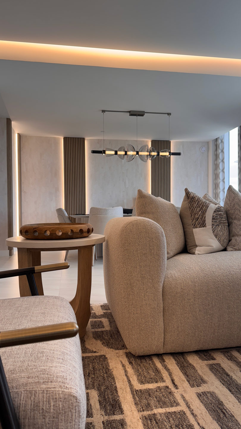
The primary function of contrast is to draw the eye to accented areas of a spaces design. If your eye is drawn to too many places at once, this is where chaos overtakes cohesion. In each room, we recommend choosing one key contrast point to avoid overworking your space. If you have a bold pattern on an area rug, give it space to shine. Don’t also choose upholstery for a chair in an accented color, as your space will begin to feel visually full and cluttered.
Because we’re drawing the eye, we can use contrast to call attention to certain parts of a space. For example, drawing attention to a piece of wall art centered behind a bed brings our focus to the central area and bed. A custom writing desk sitting near a window with custom hardware can draw attention towards the light, framing the desk’s place in a room. On the other hand, placing accented home accessories close to the ground in a shelving unit pulls attention away from the rest of the room’s design, working against the feeling of balance and cohesion that contrast should bring.
Cohesive Contrast in Interior Design By Designers Mark
Contrast in interior design can easily overwhelm a space. Here at Designers Mark, we know how to balance contrasting elements with the rest of your home’s design. Explore how our home design can reach new levels of sophistication with focused curation and personalized styling.
Beautiful spaces begin with inspired design. Contact us today at 561-961-4149 for a private consultation about your space and a tour of our Boca Raton showroom. Find your inspiration and make your mark with us.